Recently, a lot of people have been making incorrect claims about what a gender pay gap tells you. I have been pointing out these errors but in doing so, I am conscious I come across as a pedant or a negative voice. The problem is that the official gender pay gap measure (the difference between the median man and the median woman) is just a single number and that single number does not capture the full nuance of what is going on. I have decided it is time to introduce the Gender Pay Fingerprint to the world as an alternative and going forward, I will be encouraging people to use this instead.
Employers are already producing Gender Pay Fingerprints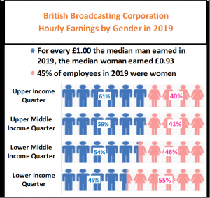
When employers’ submit their annual returns, in addition to reporting the mean and median gender pay gap, they also have to report the gender breakdown for each Income Quarter. Together, these figures make up the Gender Pay Fingerprint for the employer. So employers already have the data, what they are not doing is putting it altogether into a single picture i.e. a fingerprint.
Why Income Quarters are so important
 If gender parity is your goal, what would be the perfect set of figures to report? It is not just that your pay gap is zero, I would contend that it would also be an employer with 50:50 men and women across all pay scales and job functions. In other words wherever you look, you will see a perfect gender balance. In other words your chart would look like the one to the left.
Can we expect every employer who (correctly) reports no gender pay gap to look like this? The answer is no since all we need is the same gender ratio in each income quarter but that ratio could be anything from 100:1 men:women to 1:100 men:women as shown in the 3 charts below.

If we saw 3 employers like this, you should have 3 different reactions even though each is reporting no gender pay gap which is what we want. The one on the left is clearly male dominated which should prompt the question why? Conversely, the one of right is female dominated which should also prompt the question why? In both cases, it is possible that this reflects genuine gender preferences but I take the view that this conclusion should only be reached once all other explanations have been exhausted.
These charts don’t show the mean gender pay gap. I have regularly downplayed the importance of the mean pay gap since it can be influenced by a few highly paid individuals but it would be reasonable in all 3 cases above to expect the mean pay gap to also be zero. If the mean pay gap differs notably from zero, that might be a clue to a possible equal pay issue though further analysis would be needed.
Let’s look at another 3 employers, all with no median pay gap. What would be your reactions this time?

Again you should have 3 very different reactions. Mine are –
- Left – men undertake both the highest and lowest paid roles with women doing the middle paid roles. Why? It’s possible it reflects a sense of “this is men’s work, that is women’s work” which is something to challenge. It’s worth highlighting that the mean gender pay gap could also be zero in this instance though it depend on how highly paid the senior management in the upper quarter are.
- Middle – I call this a Glass Ceiling employer. In the bottom two quarters, it is 50:50 men:women but then in the 3rd quarter it’s all women and in the top quarter, all men. Whilst the median pay gap has to be zero, the mean pay gap will not be zero since the average man must be earning more than the average woman. So clearly the question that has to be asked here is why are women not present in the upper quarter? What stops them from getting there?
- Right – the quarters alternate between men and women. Again the median pay gap will be zero but the mean pay gap will be considerable. This could indicate a serious equal pay problem in that among the low paid quarters, men are earning more than women and this is repeated among the high paid quarters.
By now, you’ve seen 6 employers with the same pay gap but with very different set of questions. That is because you are looking at the 4 income quarters as well as the pay gap. Instead of one number we have 5 numbers. If we regard 4 quarters + 1 pay gap as equivalent to 4 fingers + 1 thumb, the 5 numbers make a hand and thus the term Gender Pay Fingerprint is born. I’m still trying to work out if this should be plural or not!
So far, I regard the chart format I have been using as a basic fingerprint. Later on, I will introduce a more advanced fingerprint.
Real life examples – Construction Sector in 2018
It should not be a surprise to find that the Construction sector is male dominated. Just because it is, doesn’t necessarily mean that there will be a significant gender pay gap. The pay gap is dependent on where women sit in the income quarters not on how many there are. Here are 3 employers that reported no or miniscule gender pay gaps in 2018.

Redrow & Taylor Wimpey are very similar with a gender ratio of 2:1 male:female whereas Tough Construction has a 20:1 ratio. Tough Construction actually has a pay gap favourable to women with the average woman earning £1.10 for every £1 earned by the average man compared to £0.97 for Redrow and Taylor Wimpey. Just looking at the pay gaps alone might lead you to remark on Tough Construction but when we look at the basic fingerprint we realise that the very low numbers of women mean that the pay gap there is subject to sample size error and should not be commented on.
Are these employers typical of the Construction sector in 2018? The next chart is my Advanced Gender Pay Fingerprint for Taylor Wimpey Ltd.

The 4 black triangles are the 4 income quarters for Taylor Wimpey showing the % of staff in each quarter that are female. The £ sign on the right is the median women’s earnings for Taylor Wimpey assuming that the median man earns £1. The title shows that Taylor Wimpey ticked the 5,000 to 19,999 employees bracket making them a large employer and in this chart they are being to compared 195 employers from the Construction sector.
The Construction sector is represented by the 5 Box Plots. If you’ve not seen a box plot before, I recommend you read this article. I’ve used an enhanced box plot format here where –
- The box in the middle represents (from top to bottom) the upper quartile, the median and the lower quartile.
- The diamonds/circles represents the average.
- The thick solid lines above and below the box represent the 5th & 95th percentiles i.e. 90% of employers are captured within this range.
- The thin lines take you out to the maximum and minimum of the 195 construction sector employers.
Now we can see how typical Taylor Wimpey is of the Construction sector and the answer is that they are not typical. They are just in the top 5% of construction employers for the median women’s earnings which comes about because their upper and upper middle quarters female representations are above the upper quartile whereas their lower quarter value is almost in line with the median of the sector. When I look at the entire fingerprint, the conclusion I draw is that Taylor Wimpey are an example to the whole sector of how to do gender equality. Yes the gender ratio is not 1:1 but that is not surprising given the gender stereotypes that construction can have. The important point is that it does not prevent men and women being equal otherwise. The remaining question for Taylor Wimpey is how does the gender ratio vary by type of job? That might throw up some points to be addressed.
Further examples – NHS Trusts in 2018
There are 266 employers that I classify as being NHS trusts. Here are three of them, all with negligible median gender pay gaps. What do their basic fingerprints show?

I see two key points. First, they are all female dominated. Second, their income quarters are consistent with a Glass Ceiling employer that I highlighted earlier. In fact, nearly all trusts with no pay gaps show these patterns and the advanced gender pay fingerprint for South Tyneside here confirms that this effect is sector wide.

Typically an NHS trust is 80% female in the two lower quarter, rising to 85% female in the 3rd quarter and then falling to 67% in the top quarter. I have explained numerous times before (see point 4 of this article) that because the sum of the top 2 quarters (67%+85%) is less than the sum of the bottom 2 quarters (80%+80%) this will result in the median woman earning less than the median man hence why NHS trusts typically have a gender pay gap against women. South Tyneside is among the 5% of NHS trusts who don’t since the sum of the top 2 quarters (90%+79%) is equal to the sum of the bottom 2 quarters (84%+85%).
Again we need to ask the question why this is the case. It is worth noting that for the sector as a whole, women still make up the majority of the high earners in the top quarter. It is because the NHS is extremely female dominated in the other 3 quarters that causes the pay gap. That suggests that one solution is to recruit more men into the bottom 3 quarters. The minimums from the advanced fingerprint above suggest that a male dominated trust might exist and sure enough I found that Surrey & Borders Partnership NHS Foundation Trust had only 25% women. But then I saw that in 2017, they had 75% women and it was immediately clear that Surrey & Borders had accidentally swapped men and women around in their 2018 submission.
Fingerprints help you to spot errors
Have a look at these 3 employers’ basic fingerprints. What do you see?

You should see that Preston Council are candidates for the ultimate gender parity prize with no pay gap and almost 50:50 across all quarters. CT Plus and Motorline though have made mistakes with their submissions.
For CT Plus, it is the fact that the gender ratios are identical in all 4 quarters. That strongly suggests they have worked out their overall gender balance and then entered that in each quarter. The reason why that is likely is because the median woman only earns 74p. That either indicates a massive equal pay issue or far more likely that the data is incorrect.
For Motorline, their median woman’s earning of 72p cannot be right given that the sum of top two quarters (19%+44%) is equal to the sum of the bottom two quarters (41%+22%). That means the median woman should be earning £1 for every £1 earned by the median man. Their gender pay gap report is not informative but I suspect they have miscalculated somewhere. One possibility is that the lower and lower middle quarters were inadvertently entered the wrong way around.
The Gender Pay Fingerprint for the UK in 2018
I will finish by showing the fingerprint for all employers in 2018. It turns out that the Gambling Commission is closest to being median of the median across all fingers and thumbs.

Nationally this tells us why the overall gender pay gap was 9p in the £ in 2018. For the top 3 quarters, female presence declines slowly but then falls to 40% in the top quarter. Whilst some rebalancing of the bottom 3 quarters is needed to close the pay gap e.g. recruiting more men into low paid roles, it does suggest that the biggest improvement will come from getting more women into the top quarter. Understanding what those barriers are today and how they can be overcome tomorrow is what employers need to be doing with their pay gap analytics.
Where can I get these fingerprints?
The basic fingerprints can be found by downloading my spreadsheet from this link.
That spreadsheet contains the data you need to create the advanced fingerprint. I am currently developing a template to allow you to create this automatically. However, I am only making this available to my clients who book either my Analytics or Training services from the list below.
– Need help with interpreting your pay gaps? –
I offer the following services.
- Analytics – I can dig deep into your data to identify the key drivers of your pay gaps. I can build a model using a large number of variables such as pay band, seniority, job function, location, etc and use this to identify the priority areas for closing your gaps.
- Training – I run training courses in basic statistics which are designed for non-statisticians such as people working in HR. The courses will show you how to perform the relevant calculations in Microsoft Excel, how to interpret what they mean for you and how to incorporate these in an action plan to close your gaps.
- Expert Witness – Has your gender pay gap data uncovered an issue resulting in legal action? Need an expert independent statistician who can testify whether the data supports or contradicts a claim of discrimination? I have experience of acting as an expert witness for either plaintiff or defendant and I know how to testify and explain complex data in simple language that can be easily understood by non-statisticians as can be seen from my testimony to the Treasury Select Committee.
If you would like to have a no-obligation discussion about how I can help you, please do contact me.
– Want to know more about pay gaps? –
I have written a number of articles about pay gaps covering these topics:-
- What gender pay gap data tells us, what it doesn’t tell us and how it can be misused
- Where can I find the latest gender pay gap data?
- Why the gender pay gap is not the same as unequal pay
- Three distinct errors that have been made by at least 10% of all organisations when submitting their gender pay gap data
- How to distinguish between a true pay gap and a pay gap that arises naturally due to the laws of chance
- Why winning an equal pay tribunal can widen a gender pay gap
- My 12 steps to improve public confidence in gender pay gap data
- My evidence to the Treasury Select Committee on how gender pay gap reporting could be improved
- Calculate your gender pay gap by downloading my free spreadsheet calculator!
- Did the gender pay gap narrow in 2018?
- How to identify unusual year on year changes in gender pay gaps
- How to close your pay gap with DMAIC
- Should the UK introduce Ethnicity Pay Gap reporting?
- What is best way to do Ethnicity Pay Gap reporting?
- Frequently Asked Questions about gender pay gaps.
Finally visit my Twitter thread to see my comments on gender pay gaps in the media. Some notable ones are here.
