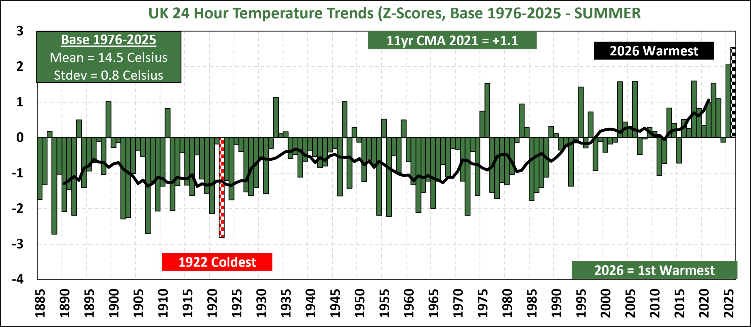
The 2026 meteorological summer in the UK was the warmest on record, surpassing the record set last year. Unlike 2025 whose record was due to steady warmth, 2026 came from a series of heatwaves. Despite that none of the 3 months individually set new records but as a collective, they added up to a new temperature record.
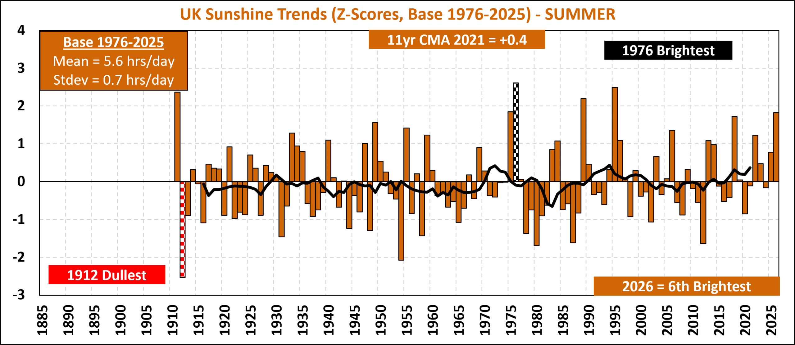
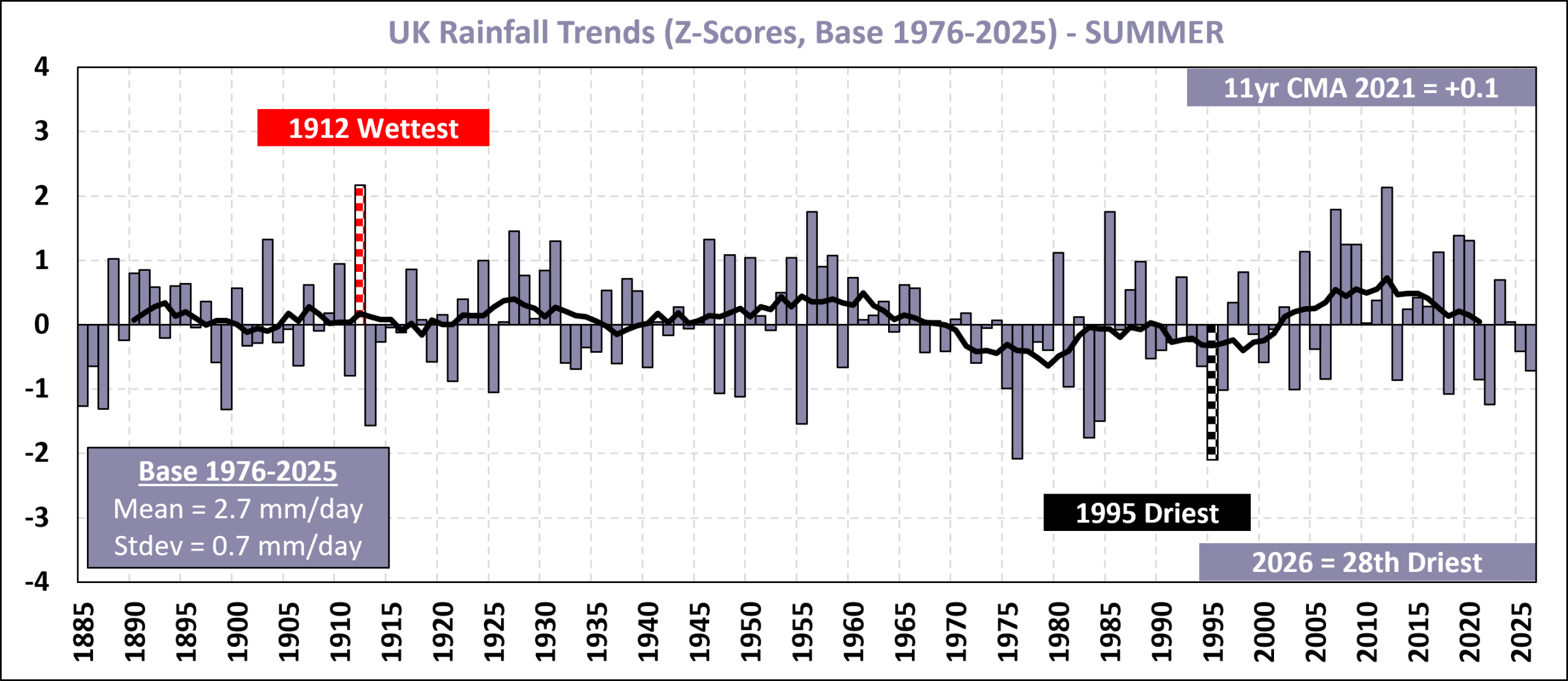
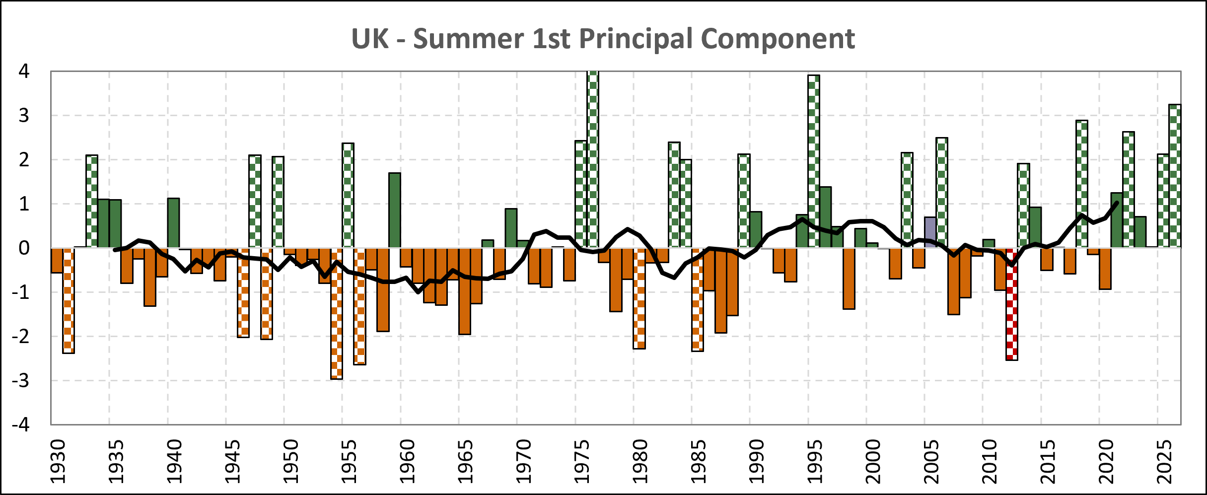
It was also the 6th sunniest summer on record but whilst it was drier than usual, the dryness was not unusual. That might surprise those experiencing hosepipe bans in certain places but this was due to significant regional variations in rainfall. Consequently, whilst 2026 can be regarded as the 3rd “best summer” of all time through the lens of the 1st principal component, it still had some way to go reach the folklore of 1976 and 1995. More than that, since we have now had two “nice” summers in a row, history tells us these have never been followed by a 3rd “nice” summer so plan accordingly for 2027!
Meteorologists define summer in the UK to be the period from June to August so summer is now over and we are officially in autumn.
I analyse the long term trends in the UK weather using a statistical tool known as Standardisation. This means the three key variables of Temperature, Sunshine and Rainfall are recalculated so that they all have the same units, which is number of standard deviations above or below the mean. Such variables are known as Z-Scores which by definition will have a mean value of 0 and a standard deviation of 1. For more information on how I have done this, please read my post on trends in the UK summer of 2017.
Latest Z-Scores
The Z-Scores for Temperature, Sunshine and Rainfall are shown in the three charts below. Each chart also contains an 11-year centred moving average which gives an idea of the underlying trend.
** In Spring 2024, I added the Z-Score plot below for Rain Intensity since the Met Office has released more historical data. Rain Intensity is the average rainfall per rainy day as opposed to rainfall per day shown in the Rainfall chart. I use this variable as a proxy for how stormy or calm the weather has been. For now, I do not include rain intensity in my analysis of long term trends.
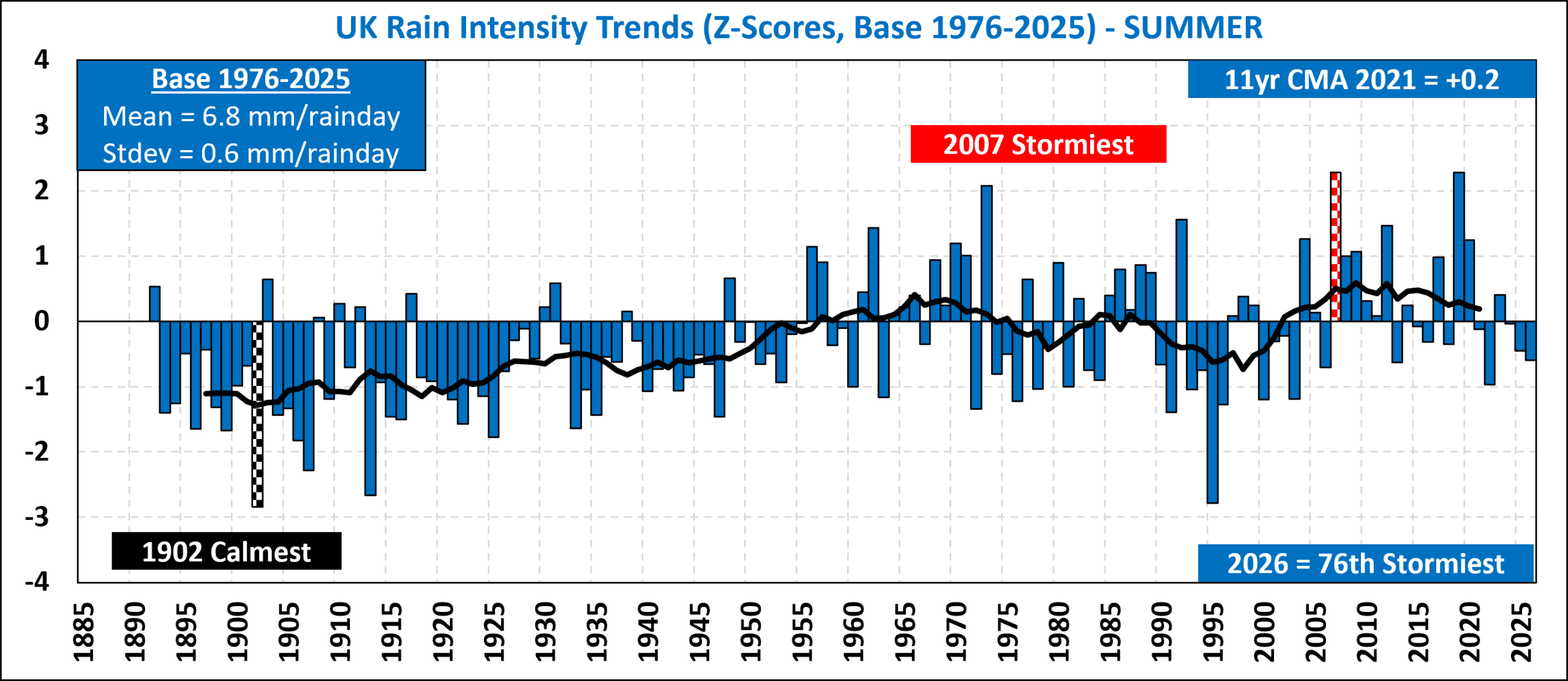
Standardised variables aid interpretation of data in many ways. If the standardised value is positive, it means that the value is above your average or expected value. If it is negative, then the value is below your expected value. If the original variable is approximately normal in its distribution then the vertical scale gives us an idea of how typical or atypical each year is.
Z-Scores in the range -1 to +1 are considered typical values and completely unremarkable. Z-scores in the ranges -2 to -1 and +1 to +2 are considered to be uncommon values but still entirely plausible and such values should not cause us concern. When Z-Scores get into the ranges -3 to -2 and +2 to +3, we should start paying closer attention and asking ourselves if something has changed especially if we get a sequence of successive points in these ranges. Finally, if the Z-scores are less than -3 or greater than +3, that is normally regarded as a clear call to action.
There are in fact many ways of interpreting Z-Scores and what I have said so far merely a gives an overview of the most basic interpretations. A whole field of study known as Statistical Process Control (SPC) is dedicated to building and interpreting such charts (known as Control Charts).
For the summer of 2026, the z-scores for temperature, sunshine and rainfall were respectively +2.5, +1.8 and -0.7. This is the second time temperatures have been more than two standard deviations above the mean of the last 50 years, the first occasion being last year.
Long Term Climate Trends
Since the moving averages in the above charts all use the same units, they can be plotted onto the same chart as below. For now I do not include rain intensity in this chart.
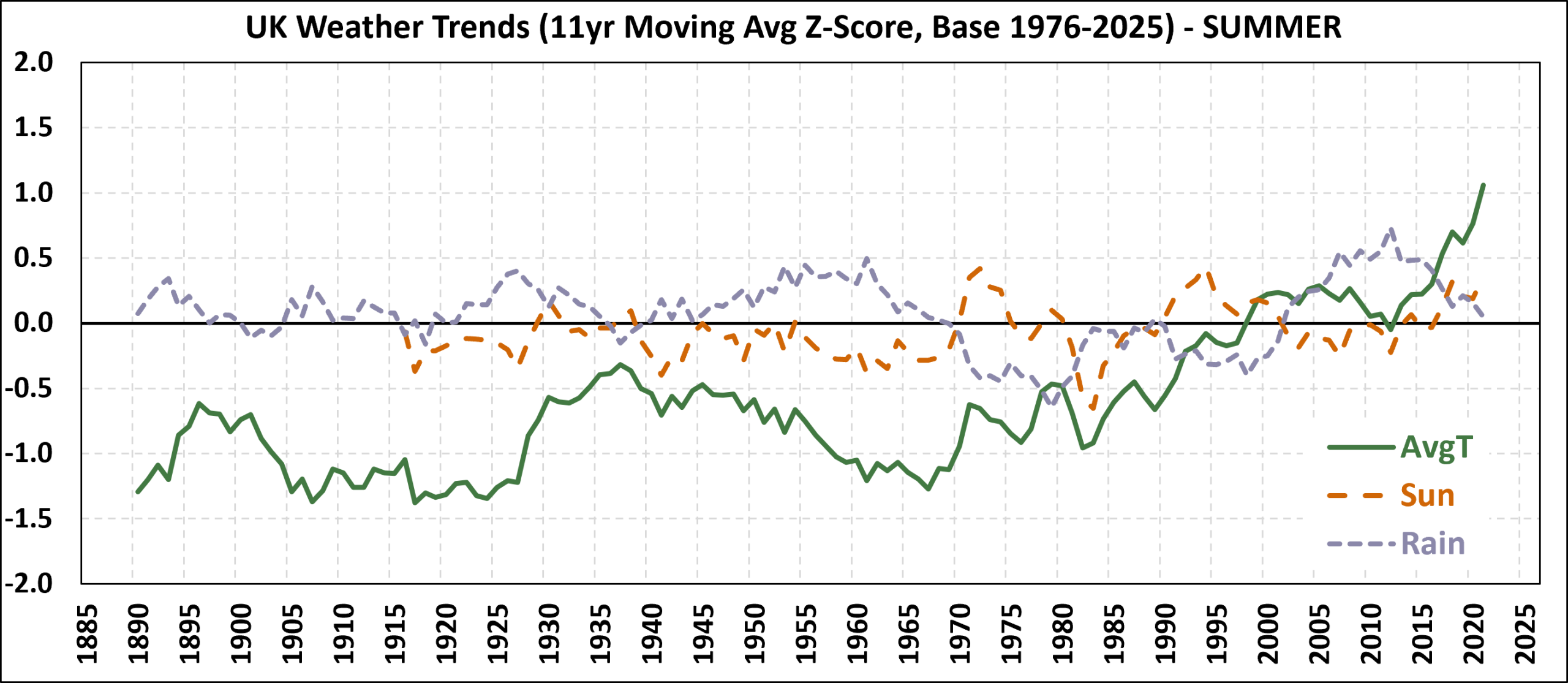
This clearly shows a shift in our summer climate over the last 100 years of more than 2 standard deviations for temperature. Recall the baseline for the z-score calculation is based on the idea of “living memory” which I have defined to be the last 50 years of 1976 to 2025. We can characterise our summers broadly as follows:
- 1915-1970 – we had cold and damp summers.
- 1970-1995 – we had dryer and almost normal temperature summers.
- 1995-2019 – a clear shift in our climate occurred to warm and wet summers.
- NEW 2020-Today – we continue to have warm summers but they are no longer wet.
Last year, I said “2025 might have been drier than usual but it doesn’t contradict the recent climate period (from 1995) for all three variables”. Following another below average summer in terms of rainfall, I have decided we have entered a new era of warm summers as before but no longer wet summers.
How many dimensions does summer have?
The long term trends chart above suggests that the z-scores for temperature, sunshine and rainfall all appear to be correlated. In fact this can be illusory as the above chart uses moving averages. If we look at the actual z-scores, we can see what the correlations are in the three scatter plots below.
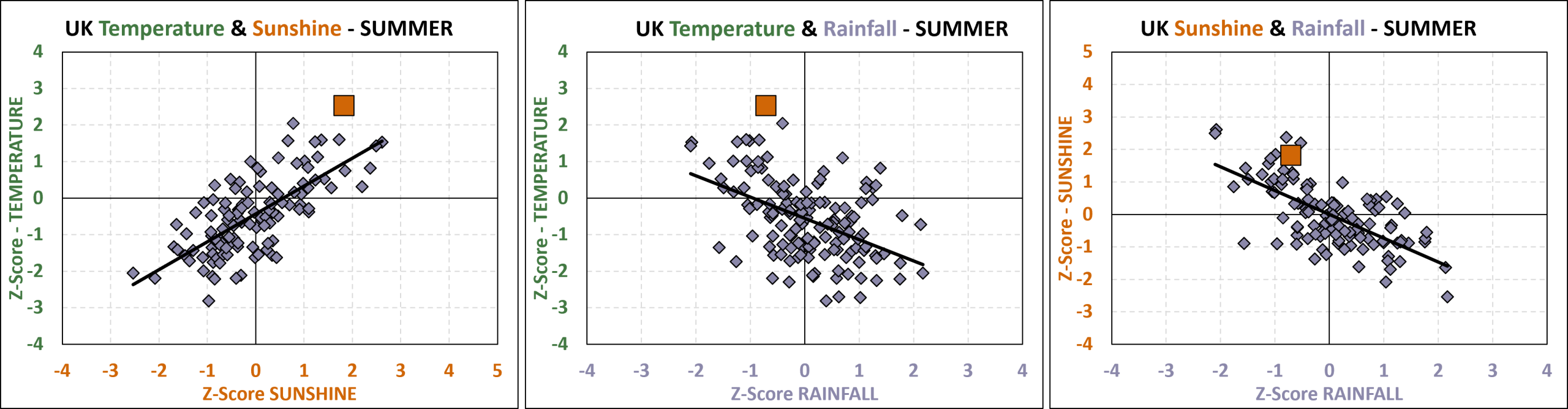
The brown square in each chart is 2026. Scatter plots can be useful to identify unusual years that do not follow the normal relationships. Here we see 2026 is on the edge of the typical scatter for all plots which shows it was unusual but not to the extent of breaking the historical relationship between the 3 variables.
When we examine the three scatter plots, we see all three variables are correlated with each other. A statistician would look at these charts and observe what appears to be 3-dimensional data (temperature, sunshine and rainfall being the 3 dimensions) is in fact closer to be being 1-dimensional. By using the method of PCA (Principal Components Analysis) which takes our 3-dimensional data set and calculates 3 new components which are statistically uncorrelated with each other, we see from the scree plot the 1st component (PC1) accounts for 2.25 dimensions whilst the 2nd component (PC2) accounts for 0.5 dimension.

** In the bi-plots below, rainfall has been replaced with dryness (= -1 x rainfall z-score) in spring, summer & autumn whilst winter retains rainfall. This is to aid visualisation of the biplots in terms of how the correlations change over the year. Had I used rainfall in all plots, then in the 3 seasons mentioned, the rainfall label would be on the opposite side of the circles shown.

For more information about Principal Components Analysis, please visit my link about training materials for multivariate analysis. and read the information in section A.
Summer is the only season where the weather is effectively one dimensional. The 1st principal component, which is basically an average of the three z-scores, can be thought of as a measure of how “nice” our summers are. It is worth plotting the 1st principal component over time as it suggests good summers where the 1st principal component exceeds 2 may follow a pattern of some kind.
In 2026, the 1st component was +3.25 which makes it our 3rd “nicest” summer on my definition overtaking 2018. However, it was still a long way from being as exceptional as 1976 (+4.03) and 1995 (+3.95). The reason for the difference is that both of those years were exceptionally dry whereas 2026 was drier than normal but not exceptionally so.
If you want to read my other Weather Trends posts, please click on the link or the Weather Trends hashtag below this post. Otherwise, please click the relevant season from the list below.
- 2026 – Winter, Spring, Summer, Autumn, Annual
- 2025 – Winter, Spring, Summer, Autumn, Annual
- 2024 – Winter, Spring, Summer, Autumn, Annual
- 2023 – Winter, Spring, Summer, Autumn, Annual
- 2022 – Winter, Spring, Summer, Autumn, Annual
- 2021 – Winter, Spring, Summer, Autumn
- 2020 – Winter, Spring, Summer, Autumn
- 2019 – Winter, Spring, Summer, Autumn
- 2018 – Winter, Spring, Summer, Autumn
- 2017 – Winter, Spring, Summer, Autumn
